http://makingamark.blogspot.co.uk/2012/12/the-home-front-making-mark-art-blog-2012.html
If you haven't seen the blog Making a Mark yet, then take a look. It's a huge source of info on many aspects of art including reviews of shows and books. There's a competition to guess an art work from seeing a small detail of it..tantalising... and it's now taking nominations for good blogs in different categories. You'll be sure to discover some new blogs that you hadn't found before,
Saturday, 15 December 2012
Making a Mark blog awards
Friday, 23 November 2012
Boxing - lino print


If you have, let me know if you agree...
Tuesday, 30 October 2012
Artists/printmakers
There are some great artists and in particular printmakers around and, as I have more time this week, I've been looking in a more leisurely manner at some of the blogs that I regularly check.
If you haven't come across them yet you ought to check out Sue Brown'sbeautiful enamels/prints - as books; Amanda Colville's intricate lino prints at Mangle Print; Aine Scannell's tradigital/mixed print media pieces are very interesting and she also surveys other tradigital prints too.
Katherine Tyrrell has a number of great blogs - in particular I like the one entitled, 'Making a Mark'. She is a writer and artist who, 'writes about art for artists and art lovers.
Read about: art, drawing, painting, art news, artists and painters, exhibitions, art competitions, art blogs, the art business, art economy, marketing art, art history; art techniques and tips & making a mark with pastels, coloured pencils and pen & ink.'
Thursday, 25 October 2012
Just found some fabulous mixed media prints - Shelley Thorstensen
Joan Hausrath just pointed me in the direction of some great mixed media prints by Shelley Thorstensen. I'd love to actually see them at some point, but meanwhile they do look good on the net. I particularly like 'Je ne sais Quoi'. Worth a look for sure st www.printmakersopenforum.org/shelley_thorstensen
Wednesday, 24 October 2012
Gum Arabic prints shown at the book launch on 19 Oct
I like the fragile, decaying look that you can get with this printmaking method.
There's quite an eerie light hitting the fern.

The tulips are more abstract and perhaps you would struggle immediately to identify them.
The light just catches the side of the flower stalks as you look into this field of flowers.

Sunday, 21 October 2012
Pop up exhibition of iPad drawings at the book launch
These iPad drawings were on show at the book launch on 19th Oct - also a couple of gum arabic prints which I'll post later. I've included also here an image of just one lone bee so you can see the text more easily.


Successful launch of new book by Offa's Press at Wolverhampton Art Gallery, 19 Oct 2012

It's not just because my illustration is on the cover, but this book does look and feel good. I love reading books on Kindle but this book does remind you of what you can miss if you don't also hold a real book in your hands!
There's a great range of poetry in the book - some with a scientificbotanical feel (Nadia Kingsley), humorous and insightful,(Emma Purshouse), futuristic and entertaining (Brenda Read Brown), the haunting image of blossom and people you have known who always take their apron off before opening the door by Marion Cocklin, then there was the line by Amanda Attfield that had me nodding in agreement, 'don't give me 50 different kinds of everything, and more...and more...', or Romalyn Ante's unpredictable and striking juxtapositions...and the calm tanka where, '...silver fish flash' by D.A. Lovell. That's not even half of them...I haven't read them all yet!

Poetry reading in the Gallery

Some of the contributors and one of the editors (Jane Seabourne)
Friday, 7 September 2012
Finding the Balance exhibition Sat 20 April - Sat 18 May 2013
Finding the Balance – exhibition at Wolverhampton Art Gallery
Saturday 20 April – Saturday 18 May
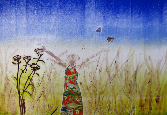
An exhibition of lino prints, monotypes, mixed media prints and iPad drawings exploring that elusive balance within your own life and environment
Finding the balance is a life’s project. On a personal level when dealing with knocks, worries and demands how do you stay calm? I asked Lilly (aged 4) and she told me that at nursery she does meditation, or as she calls it, ‘Ommm time’. I like boxercise, working in my garden, stopping to smell the flowers, having an Indian Head massage...
Creating work for this exhibition is all part of my attempt at finding my own balance. I love printmaking and have used a combination of both traditional methods, that involve using a manual etching press, and digital prints and iPad drawings.
August - Drawing and creating a design for a new lino and monotype
I sat outside in the sun with some graphite water soluble pencils drawing bees and plants and creating a design for a lino print. I had no idea that bees could be such different sizes and colours. As each bee came my way I drew it until it flew off and drew the next one...


Combination of rainbow rolled ink on the perspex, drawing with a brush from memory and with reference to sketches I did outdoors. Thinking about a possible composition, choice of colours etc.
This blog posting was delayed due to problems with the one of the photos - now happily resolved!
Boxercise

I've been looking at the effect of the cutout filter to give an idea of how this could look as a lino print. Katherine Tyrell (makingamark.blogspot.co.uk) talked about this on her excellent blog some time ago. It helps get you into the way of thinking when creating images suitable for lino prints. A' scribbly' free style of drawing is difficult to translate into the areas of tone and, although this isn't now ready to be transferred to lino it does kick start the thinking process. I'll be re-drawing it and making decisions as I do so.
Do I want this amount of shadow on the faces? Should I work with just 2 tones or increase this? If so, shall I do a reduction print or a multi-block print? Is the pose too static? Do I want these figures superimposed/layered over other figures, using transparent medium mixed into the relief ink so that both layers are visible?
Tuesday, 28 August 2012
Boxing - monotypes
I had some photos taken of me at the gym doing boxercise and used the photos as an initial reference and starting point to develop a rough sketch drawing. I used these as the basis of a monotype. Using a large roller I rolled ink on the plate (Graphic Chemical water washable maroon relief ink with extender to increase transparency) and removed some of it with paper and a brush handle. Using smaller rollers and a brush I added extra colour in selected areas. I then printed it on Fabriano paper using an etching press.
Boxing can help you find a mental balance as well as improving your physical balance.


Monday, 20 August 2012
Visit to Amanda and Richard's allotment. Monday 3 August
I'm continuing the 'Finding the Balance' research and wanted to see some allotment plots other than our own.
Last Monday I had a very interesting visit to another allotment. I enjoyed seeing Amanda and Richard's plot with its giant fennel; bright blue, flowering forest of borage; sculptural seed heads and runner beans. Some of the beans were a fabulous purple.
On another plot there were some giant onions, beautiful silver grey/purple cabbage; tall sweetcorn with large cobs and fruit bushes and trees including some narrow, tall gooseberry bushes.
How can having an allotment help create a balance in a person's life? Successful crops from an allotment can change the balance of what you buy and what you eat. It also provides exercise that you don't always realise you are getting while you are absorbed in planting,weeding or picking crops. Perhaps it's the contact with plants and the soil that is most balancing for some people. Thoughts to take away but the strongest impressions is of the shapes, colours and textures of the crops.
I plan to make some stencil shapes, draw some more on our own allotment plot and in the garden to see what develops.


Wednesday, 15 August 2012
Meeting a beekeeper and finding out more about bees - Saturday 4 August
Saturday 4 August I went to see to see Jim who keeps bees. They are situated next to a field of rape which is a food source for them. It was fascinating putting on the bee suit and getting a feeling of going into a different world. It was an eerie sight watching Jim disappearing down the garden in his suit, holding the smoker. There's a kind of sci fi look to the whole thing. Of course wearing protective clothing is an important precaution, though the smoke should calm the bees. Apparently, the smoke makes the bees think that there is a fire so they feed to increase their stores in case they have to abandon their hive. Consequently they are more interested in feeding than in stinging you and the activity of feeding distends the abdomen which also decreases the ability of the bee to sting.
It was interesting to see the honey in the wax on the frames and also the queen excluder. After a while I retreated, unstung, in the bee outfit and wellies with trousers tucked inside (essential as it stops the bees running up the inside of your trousers leg to who knows where!


Bees - finding out more about them
Some time ago I was drawing in the garden on my new iPad and wondering what kind of images I might create for the cover of a book of environmental poetry and a swarm of bees buzzed in. I watched and drew them for some hours until they took off again. In the event, a text-based image was chosen and the book will be launched in October 2012.
Since then! I've been finding out more about bees.
Monday, 13 August 2012
Gum arabic prints - Back in June
After a couple of weeks working totally digitally (see previous post) I returned to print many more gum arabic prints. Here are three of them. The bottom images were two of the prints accepted in the A4 Print exhibition in Cornwall. I wanted to try to capture a feeling of fragility and the passing of time. The fletting and often apparently timeless nature of childhood when it's possible to play on the beach without a care. The Gum arabic process and the ochres help this.

'Head with two heads'

'Pass the bucket'

'Traversing the sand'
Monday, 14 May 2012
I've gone digital.....
I've been given a beautiful Ipad by John for my birthday. The colour on the screen is very seductive and I'm enjoying trying out the drawing apps. This has slowed down my printmaking work at the moment. If you want to see any of the digital doodlings go to:
http://lindasdigitaldoodlingsfromipad.blogspot.co.uk/2012/05/using-ipad.html
I'll be back with 'proper' printing soon - probably the weekend!
http://lindasdigitaldoodlingsfromipad.blogspot.co.uk/2012/05/using-ipad.html
I'll be back with 'proper' printing soon - probably the weekend!
Sunday, 29 April 2012
Angels

These are very temperamental to print - so I feel particularly pleased when one works!
I had planned to print a few more in the studio today but had a late start. I went to see a very good cabaret yesterday evening put together by Emma Purshouse at the Bilston Imperial Banqueting Suite. I enjoyed all the acts but the Raymond and Mr Timkins Revue were particularly good, as was the compere Steve Rooney. http://www.raymondandmrtimpkins.co.uk/hello.html
Thursday, 26 April 2012
Any one for tennis?

The gum arabic process involves making a black and white photocopy of a (high contrast) photograph or a sketch and using this photocopy as your print 'plate'. Then:
- sponge gum arabic on the front and the back (it smells like the old gum spreaders that children used to use) and place it on perspex or glass
- roll oil-based etching ink over the suface of the photocopy (add plate oil or linseed oil to it to make it loose, if necessary
- sponge off the ink from the photocopy with a mixture of 50% water and 50% gum arabic - this removes excess ink from the image and takes it away from the pale areas. (oil based ink sticks to the black toner)
- carry out step 2 and 3 again
- then print the image in an etching press, using damp paper.
I've found that it's good to photocopy your image onto thick paper or even card, if possible. This makes it easier to handle and less likely to tear. If you can only get your photocopies on thin paper, then you can strengthen the back of the copy by painting acrylic gel medium on the back. This really helps the paper survive quite a lot of sponging and wetting!
Gum Arabic prints

I was working with Lin C in her studio in Ludlow last week, experimenting with gum arabic prints last week. Had a great day. I'd had a brief experiment with this process a couple of months ago but it didn't really work. Using a different 'recipe' from Anne Philmore, I got a good result. Thanks Anne!
This image is created from a photograph which I took in a local graveyard. I like the way that the process emphasises the crumbling, fragile nature of the stone itself and, I suppose, the insubstantial nature of angels! I'm going to try a few more.
Sunday, 26 February 2012
Youtube tutorial on inking and printing a drypoint
Recently I was filmed inking and printing a drypoint plate - Chris Hill did this for me and put it on Youtube. Thanks Chris - you did a great job!
http://www.youtube.com/watch?v=eFf2VjP2-nQ
http://www.youtube.com/watch?v=eFf2VjP2-nQ
Inactivity
Sometimes creativity completely stops - usually due to being overtaken by demands on your time and on your emotions. Both have been true recently. I'm sure I'll continue again soon.
Sunday, 22 January 2012
Collagraphs - still drying in the studio
Had a good day yesterday and felt inspired today. Woke up at 6am, read most of a small novel by Penelope Lively - intense images of people's lives moving forward and backward in time.
8am went into the studio, printed all day until 4pm. Didn't look at the phone, computer.....etc
Here are a few of the collagraphs with chine colle (thin pieces of collaged drawings which are glued to the image as it's printed in the etching press).


8am went into the studio, printed all day until 4pm. Didn't look at the phone, computer.....etc
Here are a few of the collagraphs with chine colle (thin pieces of collaged drawings which are glued to the image as it's printed in the etching press).


Friday, 20 January 2012
Linda's recent monotypes
Monotypes - created with oil-based water washable inks on perspex, using stencils and some chine colle.
Creating a range of moods including uplifting/on top of the world!


Subscribe to:
Posts (Atom)